Modern manufacturers produce more products across more lines (or more sites) than ever before. For quality professionals, it can be a tremendous challenge to eliminate process variation so that they are consistently producing the best quality and minimizing waste.
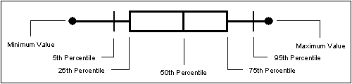
One well-known Statistical Process Control (SPC) tool that all quality pros can leverage for this purpose is a box-and-whisker chart. Even at its most basic, this type of control chart can communicate an enormous amount of information in one simple view.
In addition, with InfinityQS Quality Intelligence solutions, you can also use box-and-whisker charts to compare and align products and processes—even processes running on different lines and in different plants. When you have the ability to directly compare data from multiple sources, you can quickly see where your biggest issues are – and what actions to take to bring all your processes into alignment.
Let’s take a look at how that can work.
Viewing Multiple Process Streams on a Box Plot
Like a histogram, a box-and-whisker chart is a way to show data distribution.
For example, in the Food and Beverage industries, where filling volumes and weights are crucial, this type of chart makes it easy to see:
- That you are filling products to the minimum required levels
- What your average fill volume is
- Where you are filling less or more than required
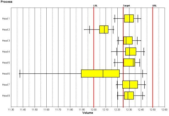
The box-and whisker chart below shows data from a beverage bottling plant. The data clearly shows that heads 2 and 6 are filling less volume than the others, and that head 6 is exhibiting the most variability. The quality engineer can quickly see that those heads may need maintenance or adjustment.
This easy, visual comparison lets you discover variances and determine where outliers present problems. You can also examine data that’s actually in spec to find benefits and savings that you didn’t even know were possible.
Consider the chart below, which shows a comparison of product weights for multiple lines at multiple plants.
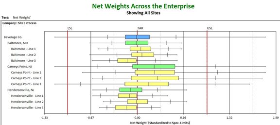
In this chart, none of the lines is producing products below the lower specification limit (LSL)—which is good from a regulatory standpoint. But the quality manager can also see that lines at Carneys Point are starting to produce product over the target weight.
If this manufacturer plumbs the data a little further, they should be able to determine how to reduce variances, tighten their target specifications, and reduce overfill—saving a significant amount of money and preventing waste.
Box and Whisker Charts Bring New Life to Your Existing Quality Data
This principle of understanding — and thus reducing — variation applies to every industry. Gaining visibility into all your quality data and being able to access all that data from one simple chart enables comparisons and analyses that you can use to improve not only your product quality, but your profitability.
Learn More: Download the white paper A Practical Guide to Selecting the Right Control Chart
Our Fact Checking Process
We prioritize accuracy and integrity in our content. Here's how we maintain high standards:- Expert Review: All articles are reviewed by subject matter experts.
- Source Validation: Information is backed by credible, up-to-date sources.
- Transparency: We clearly cite references and disclose potential conflicts.
Our Review Board
Our content is carefully reviewed by experienced professionals to ensure accuracy and relevance.- Qualified Experts: Each article is assessed by specialists with field-specific knowledge.
- Up-to-date Insights: We incorporate the latest research, trends, and standards.
- Commitment to Quality: Reviewers ensure clarity, correctness, and completeness.