A customer recently asked one of our support representatives the following questions: What is the difference between a run chart and a control chart? And when should I use one vs. the other? These are great questions because they allow us to highlight some of the benefits of control charts.
When you create any chart, you are typically trying to answer a question. For example, you might be asking, “Has my process improved?” or, “Has my process gotten worse?” You might be asking, “How is the process running today compared to yesterday?” Before you decide on using a run chart or a control chart, consider the type of question you want to answer.

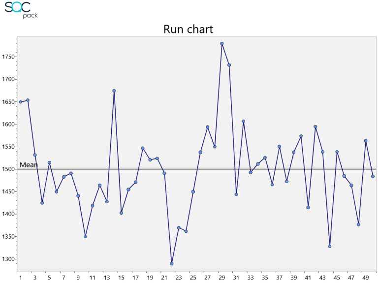
A run chart is the simplest of charts. It is a single line plotting some value over time. A run chart can help you spot upward and downward trends and it can show you a general picture of a process.

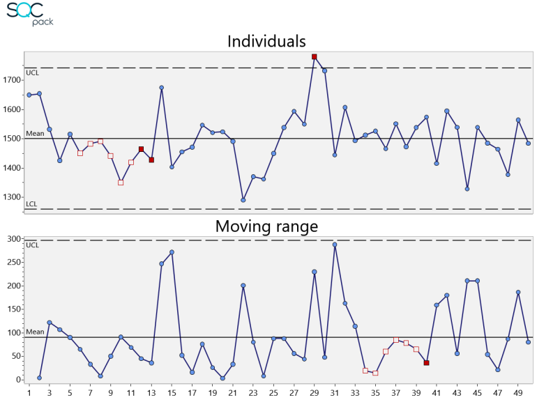
A control chart also plots a single line of data over time. However, control charts include upper and lower control limit lines with a centerline. These lines are calculated based on the data being plotted, and this allows you to answer more questions about the process. For example, you can ask the question, “Is my process stable or in control?” If any of your data is outside the limit lines, the answer is, “No. Your process is not stable.” You would then know that system changes may be required to make it stable.

Control charts are designed to prevent two common mistakes: 1) adjusting the process when it should be left alone; and 2) ignoring the process when it may need to be adjusted. Run charts lack the benefit of statistical control limits. So, if they are used to adjust your process, this may add more variation to the process instead of reducing the variation.
Both run charts and control charts are helpful, but depending on your goals, control charts generally provide more specific information and insight into your process.