The purpose of control charting is to regularly monitor a process so that significant process changes may be detected.
These process changes may be a shift in the process average (Xbar) or a change in the amount of variation in the process. The variation observed when the process is operating normally is called common cause variation. When a process change occurs, then special cause variation occurs.
Control charting captures snapshots of the process average and variation over time. By first establishing the variation we expect from the process (via control limits) when it is stable (in control), we are able to detect subsequent process changes. When specific signals are observed on the control charts, we conclude that the process is unstable (change occurred, out of control) because the probability of observing those signals if the process had not changed is very small.
Hypothesis Testing
In a statistical hypothesis test, we presume some statement, which is called the null hypothesis (H0). We also establish the alternative hypothesis (H1), which is what we are actually attempting to conclude (if the data supports it). Every time a new value is plotted on a control chart, a hypothesis is evaluated. The initial assumption is that the process is stable (in control). If, after plotting a point, we have enough evidence to reject this null hypothesis (we see a signal), we conclude that the alternate hypothesis (the process is out of control) is true.
Ideally, we would correctly reject the H0 every time the process is actually out of control. However, if the process is actually out of control, and we do not detect it, we have made a Type II error. This may be a severe error since the process has changed but we haven’t noticed it and don’t react. An appropriate sample size may be selected to minimize the occurrence of a Type II error (see the previous “Ask the Expert” article on determining sample sizes for Xbar charts).
We would also ideally not reject the H0, if in fact the process has not changed. However, if we observe a signal even though the process has not changed, we have made a Type I error (α). This error leads to inefficiency since we will react to a signal but not find any actual cause, the process having not actually changed. By convention, the probability of a Type I error (α) is specified as 0.0027 (0.27%). This results in the control limits trapping 99.73% of the statistic that is being plotted on the control chart.
Note: 99.73% equates to ±3 standard deviations from the process average, if the data being plotted is normally distributed.
Basis of Chart Signals
Now it should be clear that Hypothesis Testing is performed in order to determine whether sufficient evidence exists to conclude that the process is unstable. The common rules for identifying process instability are based on the probability of observing such signals assuming the process is actually stable.
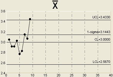
For example, suppose we observe a single point that falls outside the upper control limit on an Xbar chart as shown below:

The probability that we would observe a sample average that is more than 3 standard deviations away from the process average assuming the process is stable is only 0.0027 (since the control limits trap 99.73% of the sample averages). Because this probability is so small, we conclude that the alternate hypothesis is true and we react as though the process is unstable. Of course, we might be wrong in which case a Type I error has occurred.
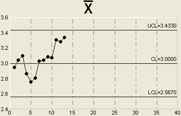
Another common chart signal is a run of 7 (or more) consecutive points above or below the center line. This is illustrated below.

So, what is the probability of actually observing 7 points in a row above (or below) the center line assuming that the process is actually stable?
For any random sample, the probability of getting a sample average above the process average is simply ½ . There is also a 50% chance of seeing a sample average below the process average.
To obtain 7 points in a row above the centerline, we need to find the probability of the following: one point being above the centerline AND the next point being above the centerline AND the next point being above the centerline and so on until 7 is reached. Essentially, it’s like flipping a coin and getting 7 consecutive heads. Since these events are independent (if the process is stable), the joint probability of getting 7 consecutive heads is simply ½ x ½ x ½ x ½ x ½ x ½ x ½ = 1/128 = 0.0078.
Thus, the probability of seeing this pattern is very small (less than 1% chance) if the process stable. Therefore, we reject this null hypothesis and conclude that the process is unstable. (In this case, it seems that the process average has shifted).
Many other rules are used by practitioners to detect trends or process shifts on Xbar charts. They include:
- 7 points in a row trending upward or downward
- 14 points alternating up and down
- 2 out of 3 consecutive points more than 2 standard deviations away from the centerline on the same side of the chart
- 4 out of 5 consecutive points more than 1 standard deviation away from the centerline on the same side of the chart
- 15 consecutive points within +/- 1 standard deviation of the centerline
The probabilities of observing many these patterns assuming a stable process are not extremely difficult to compute, but it suffices to say that the probabilities are low. Since it’s unlikely the pattern comes from a stable process, we conclude that the process is unstable and react to it.
Note that some people use slightly different rules. For example, waiting for a run of 8 points above the centerline (rather than 7). This version of the rule will result is fewer Type I errors but a greater number of Type II errors. All rules should balance the errors that can be made in interpreting control charts.
Steven Wachs, Principal Statistician
Integral Concepts, Inc.
Integral Concepts provides consulting services and training in the application of quantitative methods to understand, predict, and optimize product designs, manufacturing operations, and product reliability. www.integral-concepts.com