Quality Advisor
A free online reference for statistical process control, process capability analysis, measurement systems analysis,
control chart interpretation, and other quality metrics.

SPC DEMO
Don’t miss out! Book a demo of our specialized SPC software and unlock immediate improvements in your processes.
t-chart
What is it?
The t-chart creates a picture of a process over time. Each point on the chart represents an amount of time that has passed since a prior occurrence of a rare event. The time unit might be hours, days, weeks, months, etc. For example, a chart might plot the number of days between infection outbreaks at a hospital. A traditional plot of this data may contain many points at zero and an occasional point at one. A t-chart avoids two types of mistakes: over control and under control that a traditional control chart might generate.
The t-chart helps to identify the two types of variation present in a system, special and common cause, so that appropriate improvement actions can be taken. Specific formulas for t-chart control limits are used with this type of data. T-charts can be created using software programs like SQCpack.
What does it look like?
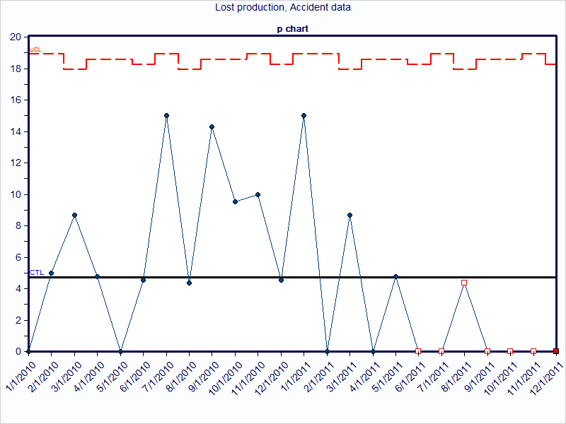
By way of contrast, consider the information that is provided with a chart of lost production due to work time accidents. The chart shows many months where there were no occurrences of lost production. Thus, this chart is not beneficial and provides little insight to know if the process changes resulted in improvement.
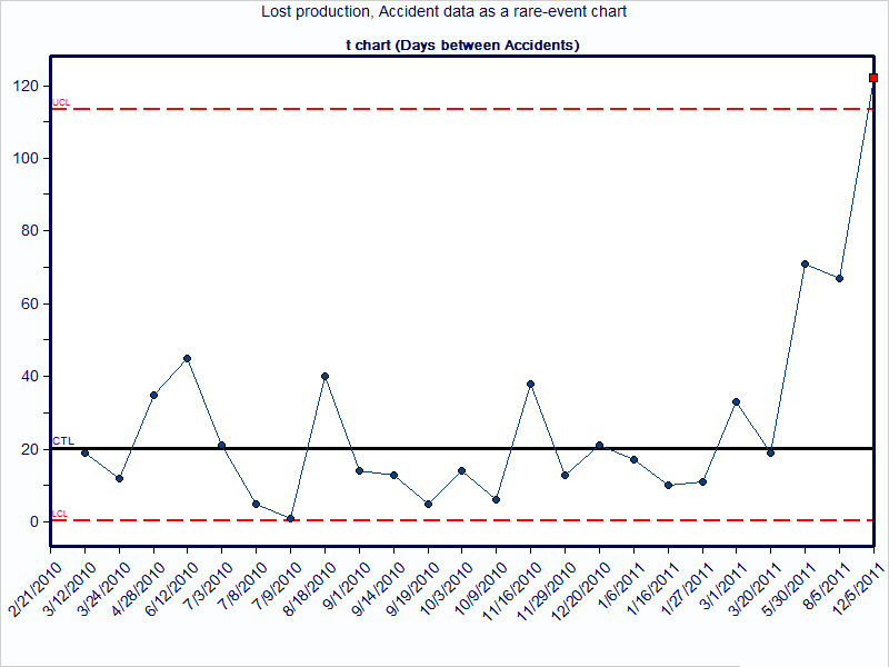
Now consider the same data using a t-chart. Instead of plotting the lost production each month, plot the days passed since the last time of lost production. The data is still being collected and charted, but the method used to analyze the information is different. This shows that an improvement is occurring (or has occurred), with the days between lost production increasing.
Quality Advisor
A free online reference for statistical process control, process capability analysis, measurement systems analysis,
control chart interpretation, and other quality metrics.
SPC DEMO
Don’t miss out! Book a demo of our specialized SPC software and unlock immediate improvements in your processes.
t-chart
What is it?
The t-chart creates a picture of a process over time. Each point on the chart represents an amount of time that has passed since a prior occurrence of a rare event. The time unit might be hours, days, weeks, months, etc. For example, a chart might plot the number of days between infection outbreaks at a hospital. A traditional plot of this data may contain many points at zero and an occasional point at one. A t-chart avoids two types of mistakes: over control and under control that a traditional control chart might generate.
The t-chart helps to identify the two types of variation present in a system, special and common cause, so that appropriate improvement actions can be taken. Specific formulas for t-chart control limits are used with this type of data. T-charts can be created using software programs like SQCpack.
What does it look like?
By way of contrast, consider the information that is provided with a chart of lost production due to work time accidents. The chart shows many months where there were no occurrences of lost production. Thus, this chart is not beneficial and provides little insight to know if the process changes resulted in improvement.
Now consider the same data using a t-chart. Instead of plotting the lost production each month, plot the days passed since the last time of lost production. The data is still being collected and charted, but the method used to analyze the information is different. This shows that an improvement is occurring (or has occurred), with the days between lost production increasing.
Quality Advisor
A free online reference for statistical process control, process capability analysis, measurement systems analysis,
control chart interpretation, and other quality metrics.
SPC DEMO
Don’t miss out! Book a demo of our specialized SPC software and unlock immediate improvements in your processes.
g-chart
What is it?
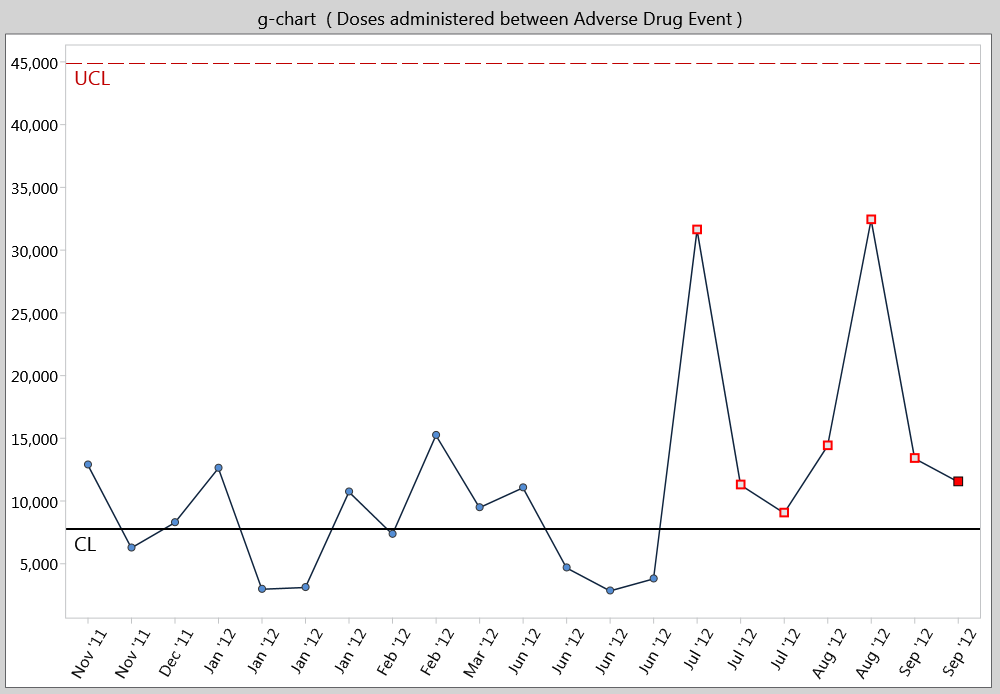
A g-chart is a chart for attributes data. It is used to count the number of events between rarely-occurring errors or nonconforming incidents.
The g-chart creates a picture of a process over time. Each point represents the number of units between occurrences of a relatively rare event. For example, in a production setting, where cars are produced daily, an unexpected line shutdown may occur. A g-chart might be used to look at the number of units (i.e. cars) produced between line shutdowns. The units produced can be almost anything. For example, you might look at the number of invoices printed, the number of customers served, or the number of patients seen, between occurrences of some event. A traditional plot of data such as this is not conducive to control chart interpretation. The g-chart helps to visualize this data in traditional control chart form. Specific formulas for g-chart control limits are used with this type of data.
The “g” in g-chart stands for geometric, since data relating to events between occurrences represents a geometric distribution. G-charts can be created using software programs like SQCpack.
What does it look like?
When is it used?
A rare event chart is used when a traditional control chart is not effective. Consider a rare event chart when one or more of these conditions exist:
- More than 20% of the data being counted has a numerator of zero.
- The denominator of a typical count-based control chart is so large that the control limits are excessively close to the average.
- The LCL (lower control limit) is missing.
Why is a t-chart used?
- To see if the process is stable and predictable
- To see how a planned change affects the process
- To track the passage of time between relatively rare events
Why is a g-chart used?
- To see if the process is stable and predictable
- To see how a planned change affects the process
- To track the number of units counted between relatively rare events
Getting the most
Here are some processes in various industries that lend themselves to rare event application.
Healthcare
- Wrong-site surgeries
- Patient falls
- Infection outbreaks
- Accidental needle sticks
- Harmful medication errors
Manufacturing
- Product liability lawsuits over 1 million dollars
- Accidental deaths or dismemberments
- Production line stoppages
- Days since last accident
Service
- Power outages over 1 minute
- Bank statement errors
Education
- School closings
- Days between a student’s absences
Quality Advisor
A free online reference for statistical process control, process capability analysis, measurement systems analysis,
control chart interpretation, and other quality metrics.
SPC DEMO
Don’t miss out! Book a demo of our specialized SPC software and unlock immediate improvements in your processes.
Rare event chart
A rare event chart is a control chart that provides information about the process being studied where the data comes from rarely-occurring incidents. It provides insight into a process when tracking quality measures that occur infrequently enough that tracking them on a traditional control chart tends to be ineffective. Rare event charts were developed in response to the limitations of attributes control charts and individuals charts in rare event scenarios.
In a typical count or attributes control chart, there is a numerator (what is counted) and a denominator (the sample size or items in the pool to count). If many of the periods being counted are zero because no incident has occurred, a chart with many flat lines ensues, where everything is plotted along the x-axis. When an incident occurs, the count of one for this period is plotted, then the counts drop back to zero for the next few periods. This cycle continues, and the resulting control chart looks odd, the control limits are not effective, and the chart fails to provide proof of quality performance.
Two types of rare event charts exist. A t-chart measures the time elapsed since the last event, and a g-chart counts the number of possible opportunities since the last event.
Quality Advisor
A free online reference for statistical process control, process capability analysis, measurement systems analysis,
control chart interpretation, and other quality metrics.
SPC DEMO
Don’t miss out! Book a demo of our specialized SPC software and unlock immediate improvements in your processes.
Pareto diagram
What is it?
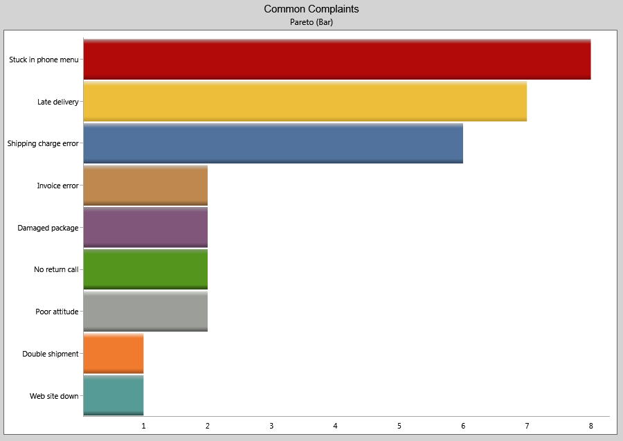
A Pareto diagram is a simple bar chart that ranks related measures in decreasing order of occurrence. The principle was developed by Vilfredo Pareto, an Italian economist and sociologist who conducted a study in Europe in the early 1900s on wealth and poverty. He found that wealth was concentrated in the hands of the few and poverty in the hands of the many. The principle is based on the unequal distribution of things in the universe. It is the law of the “significant few versus the trivial many.” The significant few things will generally make up 80% of the whole, while the trivial many will make up about 20%.
The purpose of a Pareto diagram is to separate the significant aspects of a problem from the trivial ones. By graphically separating the aspects of a problem, a team will know where to direct its improvement efforts. Reducing the largest bars identified in the diagram will do more for overall improvement than reducing the smaller ones.
There are two ways to analyze Pareto data depending on what you want to know:
Counts Pareto: Use this type of Pareto analysis to learn which category occurs most often, you will need to do a counts Pareto diagram. To create a counts Pareto, you will need to know the categories and how often each occurred.
Cost Pareto: Use this type of Pareto analysis if you want to know which category of problem is the most expensive in terms of some cost. A cost Pareto provides more details about the impact of a specific category, than a count Pareto can. For example, suppose you have 50 occurrences of one problem and 3 occurrences of another. Based on a count Pareto, you would be likely to tackle the problem that occurred 50 times first. However, suppose the problem that occurred 50 times costs only $.50 per occurrence ($25 total) and the problem that occurs 3 times costs $50 each time ($150 total). Based on the cost Pareto, you may want to tackle the more expensive problem first. To create a cost Pareto, you will need to know the categories, how often each occurred, and a cost for each category.
What does it look like?
An example of a counts Pareto diagram is shown below.
When is it used?
Use a Pareto diagram when you can answer “yes” to both these questions:
- Can data be arranged into categories?
- Is the rank of each category important?
Getting the most
Despite its simplicity, Pareto analysis is one of the most powerful of the problem-solving tools for system improvement. Getting the most from Pareto analysis includes making subdivisions, multi-perspective analyses, and repeat analyses.
Subdivisions are useful when data has been first recorded at a very general level, but problem solving needs to occur at a more specific level. A retail chain manager might create a Pareto diagram for all the customer returns of furniture by store in his district. Once he or she has identified the store which contributes most returns to the total, the next step might be to analyze that store’s returns by furniture type. If “chairs” turned up as the biggest category of furniture returns for the store in question, yet another Pareto of chair returns might help to discover whether dining room chairs, occasional chairs, wooden chairs, or upholstered chairs were being returned more frequently. Because the Pareto principle holds for subgroupings of data, such successive analyses can be performed to help teams target small elements of a large problem.
Multi-perspective analyses are useful when data can be stratified or subdivided in several different ways. The retail manager might study customer returns of furniture by number of units and again by cost. A store might discover that chairs have accounted for the majority of items returned over a period of time, but that fine dining sets accounted for the majority of cost. Depending on priority, the problem could be attacked to reduce either the highest frequency or the highest cost item. The district retail manager might study his or her district-wide furniture returns by store, by lot number, by furniture type, by cause for return, by frequency, by cost, by salesperson, by delivery carrier, or by any other set of categories he or she thinks may reveal opportunities for improvement. Multi-perspective Pareto analysis helps assure that a set of data is reviewed from all angles and that many explanations for variability are considered.
Repeat analyses are useful when improvement activity is underway and performance data is changing over time. If the retail manager worked with the store’s delivery staff to reduce the number of fine dining sets being damaged and subsequently returned, it would be useful to repeat an earlier Pareto analysis using more recent data to see if the target category has shrunk. Depending on the cycle of data collection—hourly, daily, weekly, monthly, quarterly, or other—repeated Pareto analyses help to monitor the improvements made to the system producing the data.
Caution is in order for users of Pareto analysis who have not monitored the systems they are studying for stability. A wildly fluctuating system will produce inconsistent Pareto rankings that can lead to misjudgments. If, for example, the retail manager failed to note that customer furniture returns varied greatly from month to month, the ranking of categories may be entirely different in a month with high returns from those of a month in which returns were unusually low. Repeated Pareto analyses can help to confirm rankings, but the most effective protection against being misled is to first use a control chart to tell if the system is stable and predictable.
Quality Advisor
A free online reference for statistical process control, process capability analysis, measurement systems analysis,
control chart interpretation, and other quality metrics.
SPC DEMO
Don’t miss out! Book a demo of our specialized SPC software and unlock immediate improvements in your processes.
Pareto data
What is it?
If your counts data can be arranged into categories and the rank of each category is important it is considered Pareto data. Pareto analysis is based on the law of the significant few versus the trivial many. For example there are often many causes to a problem but only some of them are significant.
How is it used?
The purpose of a Pareto diagram is to separate the significant aspects of a problem from the trivial ones. By graphically separating the aspects of a problem, a team will know where to direct its improvement efforts. Reducing the largest bars identified in the diagram will do more for overall improvement than reducing the smaller ones. You can use a Pareto diagram to see frequency of occurrence or to compare cost and occurrence. Software packages such as SQCpack can generate Pareto diagrams from your data.
Use a Pareto diagram to analyze this type of data.
Quality Advisor
A free online reference for statistical process control, process capability analysis, measurement systems analysis,
control chart interpretation, and other quality metrics.
SPC DEMO
Don’t miss out! Book a demo of our specialized SPC software and unlock immediate improvements in your processes.
Frequently-asked questions about capability
- Are Cpk & Ppk acronyms? If so, what do they actually mean or represent?
- What is the difference between Cp and Pp?
- What is the difference in the formulas for Cpk and Ppk?
- Are there maximum values for Cp, Cpk, Pp and Ppk?
- How can I improve Cpk value, when it is less than 1.0?
- Is it possible to have a Ppk value of 10 and a Pp number of 5?
- What do the letters in Cp and Cpk stand for?
- Why do capability indices formulas divide by 3?
- What is an ideal Cpm value?
- Can I compare two processes based on only the Cpk values of each of them?
- Can the process performance index Ppk be applied on the ongoing process? If yes, how?
- Why would I have Cp and Cpk indices well over 1 when some readings are outside the specification limits?
Are Cpk & Ppk acronyms? If so, what do they actually mean or represent?
Since their introduction, there has been a lot of speculation as to meaning. Here is my two cents worth.
Cp has always been know as capability of the process since I became aware of it and it has been around for some time. My connection with Cpk came through the Ford “Continuous Process Control and Process Capability Improvement Manual” probably more than 20 years ago. In the Ford manual, a k value was used to represent the number of standard deviations between the Target. I would assume that the Cpk came literally from Cp with a k factor adjustment. In reference to the Pp and Ppk, the reference from the beginning has been to Process Performance as opposed to Process Capability.
What is the difference between Cp and Pp?
The technical difference is that the 6 sigma used for the Cp calculation (or the 3 sigma used for the Cpk calculation) comes from the estimate of sigma based on the average range, and the 6 sigma used for Pp calculation (or 3 sigma used for the Ppk calculation) comes from the estimate of sigma based on using all the data and the classical formula for the standard deviation. View the formulas for Cp and Cpk; view the formulas for Pp and Ppk.
In general, if the process is in control and normally distributed (standard assumptions when doing capability analysis), both values should be close. However, since most processes wander around a little bit (and are in control), an intuitive interpretation is that the Cpk is what you could be doing and Ppk is what you are doing.
What is the difference in the formulas for Cpk and Ppk? The only difference I see is the i and r after the sigma symbol. What are these referring to?
The six sigma used for the Cpk calculation comes from the estimate of sigma based on the average range (r). The six sigma used for the Ppk calculation comes from the estimate of sigma based on using all the Individual data (i) and the classical formula.
In general, if the process is in control and normally distributed (standard assumptions when doing capability analysis), both values should be close. However, since most processes wander around a little bit (and are still in control), an intuitive interpretation is that the Cpk is what you could be doing and Ppk is what you are doing.
Are there maximum values for Cp, Cpk, Pp and Ppk?
No. As long as the spec range does not change and you continually reduce the variation, you will increase these indices. I have seen as high as 36 and have heard of higher.
How can I improve Cpk value, when it is less than 1.0?
First, compare Cpk to Cp. If Cpk is less than Cp and Cp is greater than one, center the process in the specification. This should make Cpk comparable to Cp. If Cp and Cpk are less than one, there are two actions you can take. The first (an unadvisable one) is to widen the specification particularly on the side that has the spec limit closest to the center of the process. The second and more advisable answer is to improve the process by reducing variation in the process. If the process is off-center, it would be advisable to try to center it as you try to improve it.
Is it possible to have a Ppk value of 10 and a Pp number of 5?
This should not occur. You might have a negative number for the Ppk that is larger in absolute value then the Pp number. This implies that the process mean lies outside the specification limits.
What do the letters in Cp and Cpk stand for?
There is no authoritative answer. Cp has been around for a long time and many believe it stands for Capability of the Process. Others say Process Capability, but that would reverse the letters.
As for Cpk, in the literature that I first saw about Cpk, k was the amount of the difference in the target value and in standard deviations (the number of standard deviations that the process is off target). Before you ask, Pp generally is said to be Process Performance.
Why do capability indices formulas divide by 3?
When calculating Cp you divide the specification range by six sigma. This is plus and minus three sigma on each side of the mean of the process which would include about 99.7% of the distribution of output if the process is normal. Cp considers only the spread and not the centering of the process. Consequently, you can have a capable process (Cp > 1) and not be making any good product. Cpk considers the mean of the process and calculates two values. Since the specification has been split into two pieces, the process spread is split into two as well.
What is an ideal Cpm value?
Generally there is no “ideal.” Bigger is always better. The difference in Cpm as defined in SQCpack is in the calculation of the stand deviation or variance term. The standard deviation for Cpm is based on using the target value rather than the mean which will make sigma(pm) larger and Cpm smaller when the process is not centered on the target value. You could say “ideally” the process should be centered in the specification making Cpm = Cp. However, Cp might only be 0.80 which clearly is not “ideal.”
Can I compare two processes based on only the Cpk values of each of them? Is there any other tool by which I can say that one process is better than other?
It depends on what you mean by better. If the processes are producing the same product dimension, then you can compare them more or less directly.
Cpk includes a centering factor as well as the variation factor. Unless you want to compare centering as part of the two processes, use Cp.
Can the process performance index Ppk be applied on the ongoing process? If yes, how?
The capability indices are designed to be applied to ongoing processes. They are an indication of what a customer can expect in terms of quality from a particular process.
If you have a control chart on a characteristic for a process, SQCpack will calculate these values for you if you enter the specifications. If you do not have the software, the capability analysis article series provides information on calculating capability.
Why would I have Cp and Cpk indices well over 1 when some readings are outside the specification limits?
My first guess would be that if you look at a control chart of the data, it is out of control. Before you can do capability analysis, the process should be predictable and that requires that it be stable (in-control). For a more detailed discussion, see How can Cpk be good with data outside the specification?
Quality Advisor
A free online reference for statistical process control, process capability analysis, measurement systems analysis,
control chart interpretation, and other quality metrics.
SPC DEMO
Don’t miss out! Book a demo of our specialized SPC software and unlock immediate improvements in your processes.
Analyze for special cause variation
The key to chart interpretation is to initially ascertain the type of variation in the system—that is, whether the variation is coming from special or common causes. When the system has only common causes of variation, it is referred to as stable or in control. If, however, the system has special causes of variation, it is referred to as unstable, or out of control.
Look any of the conditions listed below, which indicate that the process is statistically unstable:
>> Any point lying outside the control limits
>> 7 or more points in a row above or below the centerline
>> 7 or more points in one direction
>> Any nonrandom pattern
>> Too close to the average
>> Too far from the average
>> Cycles
>> Trends
>> Clusters
>> Sawtooth
>> 2 of 3 points beyond 2 sigma
>> 4 of 5 points beyond 1 sigma
When you have determined whether or not there is special cause variation, declare the system stable or unstable.
Quality Advisor
A free online reference for statistical process control, process capability analysis, measurement systems analysis,
control chart interpretation, and other quality metrics.
SPC DEMO
Don’t miss out! Book a demo of our specialized SPC software and unlock immediate improvements in your processes.
Capability analysis
What is it?
Capability analysis is a set of calculations used to assess whether a system is statistically able to meet a set of specifications or requirements. To complete the calculations, a set of data is required, usually generated by a control chart; however, data can be collected specifically for this purpose.
Specifications or requirements are the numerical values within which the system is expected to operate, that is, the minimum and maximum acceptable values. Occasionally there is only one limit, a maximum or minimum. Customers, engineers, or managers usually set specifications. Specifications are numerical requirements, goals, aims, or standards. It is important to remember that specifications are not the same as control limits. Control limits come from control charts and are based on the data. Specifications are the numerical requirements of the system.
All methods of capability analysis require that the data is statistically stable, with no special causes of variation present. To assess whether the data is statistically stable, a control chart should be completed. If special causes exist, data from the system will be changing. If capability analysis is performed, it will show approximately what happened in the past, but cannot be used to predict capability in the future. It will provide only a snapshot of the process at best. If, however, a system is stable, capability analysis shows not only the ability of the system in the past, but also, if the system remains stable, predicts the future performance of the system.
Capability analysis is summarized in indices; these indices show a system’s ability to meet its numerical requirements. They can be monitored and reported over time to show how a system is changing. Various capability indices are presented in this section; however, the main indices used are Cp and Cpk. The indices are easy to interpret; for example, a Cpk of more than one indicates that the system is producing within the specifications or requirements. If the Cpk is less than one, the system is producing data outside the specifications or requirements. This section contains detailed explanations of various capability indices and their interpretation.
Capability analysis is an excellent tool to demonstrate the extent of an improvement made to a process. It can summarize a great deal of information simply, showing the capability of a process, the extent of improvement needed, and later the extent of the improvement achieved.
Capability indices help to change the focus from only meeting requirements to continuous improvement of the process. Traditionally, the focus has been to reduce the proportion of product or service that does not meet specifications, using measures such as percentage of nonconforming product. Capability indices help to reduce the variation relative to the specifications or requirements, achieving increasingly higher Cp and Cpk values.
Before capability analysis is completed, a histogram and control chart need to be completed. Easily create these charts and perform capability analysis using software like SQCpack.
When is it used?
Use the standard method for calculating capability analysis when you can answer “yes” to all of the following questions:
- Is it necessary to understand how the system performs in comparison to specification limits?
Specifications or requirements must be available to complete capability analysis. The system must also be measured in the same way as the specifications, so a direct comparison can be made. - Does the specification consist of an upper and lower requirement?
For processes with one-sided specifications, see the article capability analysis for one-sided specifications. - Are no special causes of variation present?
A system with special causes is unstable and constantly changing. If capability analysis is performed under these circumstances, it will be unreliable. Always construct a control chart and check for special causes before completing capability analysis. - Is the data in variables form?
In order to complete the standard method for capability analysis, the data must be in variables form, that is measured data, such as time, length, weight, or distance. - Do the individual values form a normal distribution?
In order to complete capability analysis using the standard method, a normal distribution is required. Use a histogram to check for normal distribution. If the distribution is not normal, non-normal capability analysis can be used. - Has the data been collected over a period of time?
There are two ways to collect data for capability analysis. The standard method is from a control chart, where the data is collected over a period of time. If data has been collected in this way, the standard method for performing capability analysis is used.
Note that if you cannot answer these questions with a “yes,” Practical Tools for Continuous Improvement includes capability analysis for one-sided specifications, trial runs, attributes data, and nonnormal data.
What does it look like?
A courier company has set up a team to look at the actual arrival time at customers’ locations to pick up packages, in comparison to the scheduled arrival time. The company guarantees pick up of packages within 14 minutes of the scheduled time. It is unacceptable to customers for the courier to arrive early. Therefore, there are two requirements: on time and up to 14 minutes late. The result of the capability analysis for this example follows.
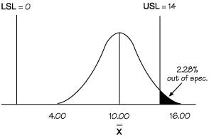
|
|
|
|
Zupper = 2.00
|
Zlower = 5.00
|
|
Cpk = 0.67
|
Cp = 1.17
|
|
Cpu = 0.67
|
Cpl = 1.67
|
A capability analysis like this can be accomplished using software like SQCpack.
How is it made?
These steps assume that variables data has been collected over time, and that a control chart and histogram have been completed. The control chart should show no special causes, and the histogram should reveal that the data is normally distributed.
In the example, the team examined the arrival time of couriers in comparison to the scheduled arrival time over a month. Since time is being measured, the data is variables. The team completed a histogram and found the data to be normal. An X- R control chart was also completed, showing no special causes of variation. Since a control chart must be completed before performing capability analysis, the calculations from the control chart can be utilized. The information taken from the control chart follows:
- The sample size used in the control chart, n
- The overall average, (from an
 chart) or (from an X-MR chart.)
 - The average range, (from an chart) or (from an X-MR chart.)
The numerical specifications or requirements should also be known. Information for the example is shown below:
n = 5
= 10.00
= 4.653
USL = upper specification limit = 14 minutes
LSL = lower specification limit = 0 minutes (on time)
Steps:
- Sketch the distribution
- Calculate the estimated standard deviation
- Determine the location of the tails for the distribution
- Draw the specification limits on the distribution
- Calculate how much data is outside the specifications
- Calculate and interpret the capability indices
- Analyze the results
The above article is an excerpt from the “Capability Analysis” section of Practical Tools for Continuous Improvement.
Frequently-asked questions about capability
- Are Cpk & Ppk acronyms? If so, what do they actually mean or represent?
- What is the difference between Cp and Pp?
- What is the difference in the formulas for Cpk and Ppk?
- Are there maximum values for Cp, Cpk, Pp and Ppk?
- How can I improve Cpk value, when it is less than 1.0?
- Is it possible to have a Ppk value of 10 and a Pp number of 5?
- What do the letters in Cp and Cpk stand for?
- Why do capability indices formulas divide by 3?
- What is an ideal Cpm value?
- Can I compare two processes based on only the Cpk values of each of them?
- Can the process performance index Ppk be applied on the ongoing process? If yes, how?
- Why would I have Cp and Cpk indices well over 1 when some readings are outside the specification limits?
Additional articles about capability
>> Cpk or Ppk: Which should you use?
>> How can Cpk be good with data outside the specification?
>> How do we determine process capability if the process isn’t normal?
>> Is Cpk the best capability index?
>> Should you calculate Cpk when your process is not in control?
>> The capability index dilemma: Cpk, Ppk, or Cpm
>> Calculating capability indices with one specification