What is it?
An X-bar and R (range) chart is a pair of control charts used with processes that have a subgroup size of two or more. The standard chart for variables data, X-bar and R charts help determine if a process is stable and predictable. The X-bar chart shows how the mean or average changes over time and the R chart shows how the range of the subgroups changes over time. It is also used to monitor the effects of process improvement theories. As the standard, the X-bar and R chart will work in place of the X-bar and s or median and R chart. To create an X-bar and R chart using software, download a copy of SQCpack.
What does it look like?
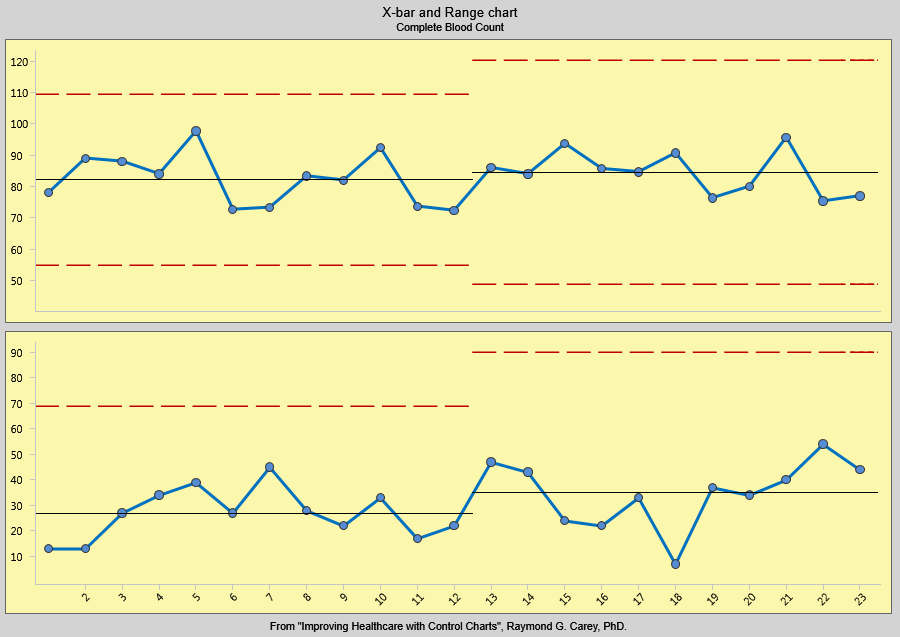
The X-bar chart, on top, shows the mean or average of each subgroup. It is used to analyze central location. The range chart, on the bottom, shows how the data is spread. It is used to study system variability.
When is it used?
You can use X-bar and R charts for any process with a subgroup size greater than one. Typically, it is used when the subgroup size falls between two and ten, and X-bar and s charts are used with subgroups of eleven or more.
Use X-bar and R charts when you can answer yes to these questions:
- Do you need to assess system stability?
- Is the data in variables form?
- Is the data collected in subgroups larger than one but less than eleven?
- Is the time order of subgroups preserved?
Getting the most
Collect as many subgroups as possible before calculating control limits. With smaller amounts of data, the X-bar and R chart may not represent variability of the entire system. The more subgroups you use in control limit calculations, the more reliable the analysis. Typically, twenty to twenty-five subgroups will be used in control limit calculations.
X-bar and R charts have several applications. When you begin improving a system, use them to assess the system’s stability.
After the stability has been assessed, determine if you need to stratify the data. You may find entirely different results between shifts, among workers, among different machines, among lots of materials, etc. To see if variability on the X-bar and R chart is caused by these factors, collect and enter data in a way that lets you stratify by time, location, symptom, operator, and lots.
You can also use X-bar and R charts to analyze the results of process improvements. Here you would consider how the process is running and compare it to how it ran in the past. Do process changes produce the desired improvement?
Finally, use X-bar and R charts for standardization. This means you should continue collecting and analyzing data throughout the process operation. If you made changes to the system and stopped collecting data, you would have only perception and opinion to tell you whether the changes actually improved the system. Without a control chart, there is no way to know if the process has changed or to identify sources of process variability.
Variables data is normally analyzed in pairs of charts which present data in terms of location or central location and spread. Location, usually the top chart, shows data in relation to the process average. It is presented in X-bar, individuals, or median charts. Spread, usually the bottom chart, looks at piece-by-piece variation. Range, sigma, and moving range charts are used to illustrate process spread. Another aspect of these variables control charts is that the sample size is generally constant.
Use the following types of charts and analysis to study variables data:
These charts, and more, can be created easily using software packages such as SQCpack.