Course Delivery Options

You Come to Our Classroom
Our classroom, located in Southfield Michigan, is generally the recommended option when possible. It has a computer for every student, fully setup with all the necessary software, and is always well-stocked with snacks. It offers a distraction-free learning environment along with a rare chance to network with other Quality professionals embarking on the same journey. There are reasonably priced hotels in the area and lots of great restaurants nearby for attendees to wind down after a stimulating day of training. See Directions and Lodging.
We Go to Your Classroom
When you have more than four employee administrators to train then your classroom may be more economical than sending them to visit us. All that is required is a computer for each student and projection capability for our instructor. DataNet trainers are often booked six weeks into the future so, if this option appeals to you, we suggest you get in touch with us as soon as you’ve decided to use this delivery method.
Virtual Classroom
The virtual classroom enables your administrator trainee to join our classroom to virtually train from wherever they may be. The user experience is as much like the in-person experience as we can make it. Attendees still get access to their own virtual WinSPC computer as well as live access to the instructor and classroom communication. It is suitable for quickly ramping-up brand new users, for use as a refresher for employees to review concepts, or to update experienced users on new WinSPC features such as the soon-to-be-released Multi-Variate Analyzer.
Virtual training can also be purchased for custom topics to permit deep dives on topics like Custom Web Reporter, QualTrend, Report Generation, Cost Inspector, Dashboards, etc.
Recorded Training
Recorded training is an option for customers who have a very limited training budget. Like the Virtual Classroom, it is also an option for users who have been to classroom training but would like to review WinSPC concepts, or for users who need to understand key concepts but are not yet able to attend a classroom session.
What to Expect
- Honest conversation about your training requirements
- Discover what training programs best fit your team
- Instant access to free, on-demand product training and documentation
Book a Demo
Try a free demo of PQ Systems and see why we are the established market-leading provider of global provider of Statistical Process Control (SPC) software solutions for manufacturing optimization.

Experience The Difference
Try a free demo and see why we are the established market-leading provider of purpose-built software for specialty manufacturing and distribution companies around the globe.
PQ Systems: SPC Software for Manufacturers
PQ Systems is now part of the Advantive family! Read announcement.
Put Quality at the Forefront with Real-Time Statistical Process Control (SPC) Software
Harness the power of data analysis to increase customer confidence, improve audit success, and meet quality compliance requirements. SQCpack by PQ Systems is a robust Statistical Process Control (SPC) solution that will help you easily analyze your data, understand and improve your processes, and communicate important quality information—all in one easy-to-use system.
Scalable SPC Software Focused on Quality Improvement
Simple and intuitive, yet accurate and complete, our world-class SPC software will help you achieve quality improvement success in record time. From aerospace to healthcare, SQCpack is trusted by organizations across an array of manufacturing industries because of its easy deployment, implementation, and operation. Whether it’s for use on a single line or in a global multi-site operation, SQCpack is a secure, scalable SPC and quality control solution that provides complete traceability and performance improvement tools to reduce recalls while meeting customer expectations and compliance standards. Features include:
Get to the discovery phase of your processes faster and reveal what your data is telling you with SQCpack control chart software. Control charts are an invaluable tool to interpret data from a process or system over time. Using the automated control chart processes in SQCpack, manufacturing organizations can analyze mass amounts of data easily in various chart formats.
Whether you have measurement or attribute data, variable or fixed sample sizes, and a subgroup size of one or more, our control charts allow users to cut through the noise and get to the information that they need.
- SQCpack Six-Way Analysis: Get a complete picture of your process from the combination of six charts, including:
- Individuals or X-bar chart
- Moving range or range chart
- Run or Median chart
- Histogram
- Normal Probability Plot
- Capability Summary
- Complete Customization: With SQCpack, you have complete control of how your charts look, including colors, fonts, line styles, and fill patterns. Label special cause data or exclude it. Easily add your logo to your SPC charts for branding and clear communication of your achievements.
Prevent quality control issues with immediate process feedback. SQCpack includes valuable features that allow you to perform offline analysis or monitor processes in real-time, so you get the feedback you need, when and how you need it. You can easily set up alerts to get immediate SPC feedback and catch quality control issues before they become a problem.
- StatBoard ®
SQCpack’s StatBoard® is a real-time process summary dashboard that summarizes several processes into one simple control chart software ranking to adjust production and make decisions that prioritize improvements.
Improve your quality performance by using capability analysis to assess whether your process is statistically capable of meeting specifications or requirements. Ensure processes are on target with minimal variation with a selection of capability analysis calculations.
- Process capability indices: Cpk, Cp, Cr, Cpm, Cpu, Cpl
- Process performance indices: Ppk, Pp, Pr, Ppu, Ppl
- Defects per million: Dpm
SQCpack helps you easily comply with industry standards including, ISO9000 & ISO9001, ISO/IATF 16949, AS9100, FDA CFR 21 part 11, and others. Our SPC software provides the security, traceability, and filtering tools you need to manage user rights, roles, and divisions; maintain an audit trail with a robust and precise record of changes; and respond to audit requests with ease.
Manually enter measurements, import data from a variety of sources like SQL and Excel, or input data directly from equipment such as CMMs and handheld measurement devices.
SQCpack is statistical software that will improve information flow, encourage collaboration, and facilitate more informed decision making with others across the plant or around the globe. Our real-time SPC software includes pre-built report templates that can be easily customized to fit your requirements. With our user-friendly reporting, dashboard, and charting tools, anyone can quickly create and share SPC charts, process capability summaries, performance statistics, critical findings, Certificates of Analysis, and more.
Optimize Your Software and Process Performance with Advantive
With more than three decades of experience in the quality improvement industry, the SPC software experts at Advantive are dedicated to helping you enhance your manufacturing quality initiatives and get the maximum return on your PQ Systems investment. We provide quality improvement consultations, hands-on customized training (on-site or virtual), and unrivaled customer service and support.

Case Study
Learn how the nation’s largest manufacturer of light-duty all-terrain vehicles and snowmobiles expanded and improved quality across its supply chain using SQCpack.
What to Expect
- Free 20-minute call with a product expert
- Live demo tailored to your industry requirements
- Discover what products best fit your needs
- No games, gimmicks, or high-pressure sales pitch
PQ Systems Training by Advantive
Explore the many training options available for PQ Systems users of all levels.

Amplify Your PQ Systems Software ROI with Expert Training
At Advantive, our team of PQ Systems experts are dedicated to helping you improve your quality processes and get the maximum return on your software investment. Whether you are looking to learn about new features or want training on statistical techniques, we offer a selection of online and in person webinars, seminars, and customized training to fit your user’s needs.
Get hands-on training by attending a PQ Systems virtual seminar – held at convenient times throughout the year.
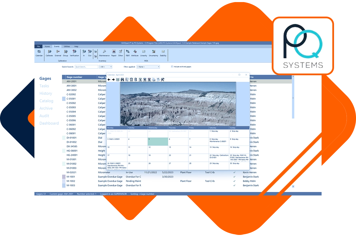
As a newcomer to GAGEpack or a veteran user of SQCpack, customized product training is a great way to ensure that you’re getting the full benefits of your investment. Our trainers will work with your organization to construct an agenda that will meet your specific quality initiatives. We can accommodate your schedule and logistics challenges with training on location, at our office, or online.
Let our SPC experts help you make processes more efficient so that you can spend your time on other value-added tasks. While the possible training topics are almost endless, a few requests that we receive quite often include:
- Getting started with SQCpack
- SQCpack charting and reporting
- Basic statistics
- Understanding process capability
Learn to optimize your gage management system using GAGEpack with the help of our expert trainers. Whether you’re learning gage calibration best practices or tackling measurement systems analysis, GAGEpack training can be customized to help your organization achieve quality improvement success.
What to Expect
- Honest conversation about your training requirements
- Discover what training programs best fit your team
- Instant access to free, on-demand product training and documentation
WinSPC Training by Advantive
Explore the many training options available for WinSPC users of all levels.

Boost Your WinSPC Software Efficiency with Targeted Training
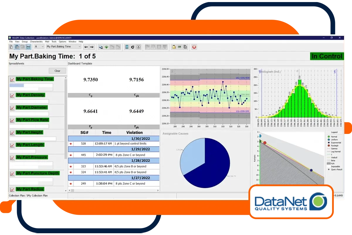
Gain the experience and skills you need to master DataNet software by leveraging our extensive training courses. In-person or online, we have training options available for every type of user and experience level. From the basics of SPC software to customized courses for advanced users, our knowledgeable instructors are here to help speed the implementation, adoption, and integration of real-time SPC into your organization.
We offer a variety of in-depth, hands-on training courses for new and seasoned WinSPC users. Instructor-led training is available in person, virtually, and onsite at your facility.
- SPC Fundamentals Training (1 day) – Educate new users on how to successfully deploy and maintain WinSPC. Students learn to: set up parts, variables, attributes and tags; configure collection plans; connect devices; layout the operator interface; perform analysis and queries; generate reports; set up alarms and triggers; build equations; administer user permissions; and perform system maintenance.
- WinSPC Administrator Training (4 days) – Learn the SPC basics of developing and interpreting control charts, histograms, capability indices (Cp, Cpk, Pp, Ppk), pareto charts, cause and effect diagrams, and more. This class is intended for SPC beginners or anyone who needs a refresher course on SPC tools.
Advantive hosts online DataNet training sessions tailored to your needs. It’s an economical way to get everyone on your team up to speed using DataNet in your manufacturing environment, or to refresh the team on SPC fundamentals. This live, interactive training is customized to cover only the topics you select and is personalized to your specific manufacturing environment.
Virtual training sessions are scheduled at your convenience, and you can include as many online participants as desired.
Recorded training is an option for customers who have a very limited training budget. This instructor-led training is delivered by DataNet senior trainers and covers 17 topic areas of DataNet functionality. The recorded training, together with the accompanying training manual, is both a cost-effective refresher for administrators who have attended the WinSPC Administrator Training course and an efficient way for occasional users to begin learning specialized features.
Improve your quality improvement knowledge with advanced training from Advantive. We offer a variety of courses, including:
- Statistical Process Control and Process Capability
- Design of Experiments
- Reliability/Weibull Analysis
- Statistics, Hypothesis Testing, and Regression
- Measurement Systems Assessment
What to Expect
- Honest conversation about your training requirements
- Discover what training programs best fit your team
- Instant access to free, on-demand product training and documentation
Five Costly Mistakes Applying SPC (and how to avoid them)
This white paper summarizes the five most common mistakes that can occur when applying statistical process control (SPC). It will provide ways to avoid making these mistakes, which could cost you wasteful scrap, valuable time, or an important customer. (12 pages)
Six SPC Charting Problems Solved
This white paper describes six time and money-wasting practices that can occur when companies implement statistical process control and provides tips on how to avoid them. You can keep your company’s SPC efforts running efficiently by following the tips described in this white paper. (6 pages)


