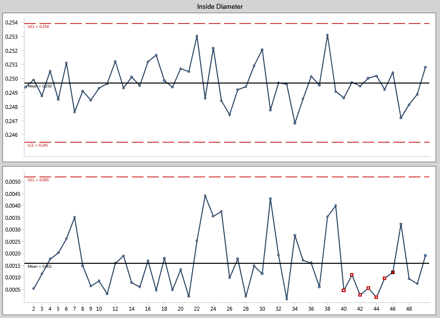
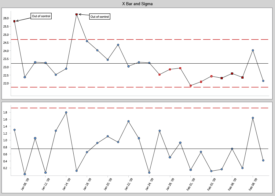
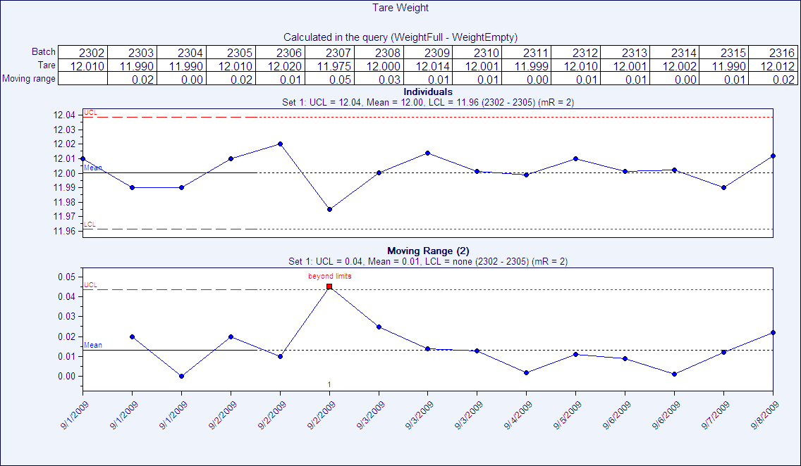
Quality Advisor

Default White Guide

SPC DEMO

Minimize Production Costs, Quickly Detect Issues, and Optimize Your Product Quality

Don’t miss out! Book a demo of our specialized SPC software and unlock immediate improvements in your processes.

p-chart

What is it?

A p-chart is an attributes control chart used with data collected in subgroups of varying sizes. Because the subgroup size can vary, it shows a proportion on nonconforming items rather than the actual count. P-charts show how the process changes over time. The process attribute (or characteristic) is always described in a yes/no, pass/fail, go/no go form. For example, use a p-chart to plot the proportion of incomplete insurance claim forms received weekly. The subgroup would vary, depending on the total number of claims each week. P-charts are used to determine if the process is stable and predictable, as well as to monitor the effects of process improvement theories. P-charts can be created using software programs like SQCpack.

What does it look like?

The p-chart shows the proportion of nonconforming units in subgroups of varying sizes.

p control chart

When is it used?

Use a p-chart when you can answer “yes” to all these questions:

1. Do you need to assess system stability?

2. Does the data consist of counts that can be converted to proportions?

3. Are there only two outcomes to any given check?

4. Has the characteristic being charted been operationally defined prior to data collection?

5. Is the time order of subgroups preserved?

Quality Advisor

Default White Guide

SPC DEMO

Minimize Production Costs, Quickly Detect Issues, and Optimize Your Product Quality

Don’t miss out! Book a demo of our specialized SPC software and unlock immediate improvements in your processes.

c-chart

What is it?

A c-chart is an attributes control chart used with data collected in subgroups that are the same size. C-charts show how the process, measured by the number of nonconformities per item or group of items, changes over time. Nonconformities are defects or occurrences found in the sampled subgroup. They can be described as any characteristic that is present but should not be, or any characteristic that is not present but should be. For example a scratch, dent, bubble, blemish, missing button, and a tear would all be nonconformities. C-charts are used to determine if the process is stable and predictable, as well as to monitor the effects of process improvement theories. C-charts can be created using software products like SQCpack.

What does it look like?

The c-chart shows the number of nonconformities in subgroups of equal size.

c control chart

Quality Advisor

Default White Guide

SPC DEMO

Minimize Production Costs, Quickly Detect Issues, and Optimize Your Product Quality

Don’t miss out! Book a demo of our specialized SPC software and unlock immediate improvements in your processes.

u-chart

What is it?

A u-chart is an attributes control chart used with data collected in subgroups of varying sizes. U-charts show how the process, measured by the number of nonconformities per item or group of items, changes over time. Nonconformities are defects or occurrences found in the sampled subgroup. They can be described as any characteristic that is present but should not be, or any characteristic that is not present but should be. For example, a scratch, dent, bubble, blemish, missing button, and a tear are all nonconformities. U-charts are used to determine if the process is stable and predictable, as well as to monitor the effects of process improvement theories. U-charts can be created using software programs like SQCpack.

What does it look like?

The u-chart shows the proportion of nonconformities units in subgroups of varying sizes.

g-chart

Quality Advisor

Default White Guide

SPC DEMO

Minimize Production Costs, Quickly Detect Issues, and Optimize Your Product Quality

Don’t miss out! Book a demo of our specialized SPC software and unlock immediate improvements in your processes.

Histogram: Study the shape

A histogram can be created using software such as SQCpack. How would you describe the shape of the histogram?

Bell-shaped: A bell-shaped picture, shown below, usually presents a normal distribution.

Bimodal: A bimodal shape, shown below, has two peaks. This shape may show that the data has come from two different systems. If this shape occurs, the two sources should be separated and analyzed separately.

Skewed right: Some histograms will show a skewed distribution to the right, as shown below. A distribution skewed to the right is said to be positively skewed. This kind of distribution has a large number of occurrences in the lower value cells (left side) and few in the upper value cells (right side). A skewed distribution can result when data is gathered from a system with has a boundary such as zero. In other words, all the collected data has values greater than zero.

Skewed left: Some histograms will show a skewed distribution to the left, as shown below. A distribution skewed to the left is said to be negatively skewed. This kind of distribution has a large number of occurrences in the upper value cells (right side) and few in the lower value cells (left side). A skewed distribution can result when data is gathered from a system with a boundary such as 100. In other words, all the collected data has values less than 100.

Uniform: A uniform distribution, as shown below, provides little information about the system. An example would be a state lottery, in which each class has about the same number of elements. It may describe a distribution which has several modes (peaks). If your histogram has this shape, check to see if several sources of variation have been combined. If so, analyze them separately. If multiple sources of variation do not seem to be the cause of this pattern, different groupings can be tried to see if a more useful pattern results. This could be as simple as changing the starting and ending points of the cells, or changing the number of cells. A uniform distribution often means that the number of classes is too small.

Random: A random distribution, as shown below, has no apparent pattern. Like the uniform distribution, it may describe a distribution that has several modes (peaks). If your histogram has this shape, check to see if several sources of variation have been combined. If so, analyze them separately. If multiple sources of variation do not seem to be the cause of this pattern, different groupings can be tried to see if a more useful pattern results. This could be as simple as changing the starting and ending points of the cells, or changing the number of cells. A random distribution often means there are too many classes.

Follow these steps to interpret histograms.

  1. Study the shape.
  2. Calculate descriptive statistics.
  3. Compare the histogram to the normal distribution.

Quality Advisor

Default White Guide

SPC DEMO

Minimize Production Costs, Quickly Detect Issues, and Optimize Your Product Quality

Don’t miss out! Book a demo of our specialized SPC software and unlock immediate improvements in your processes.

Histogram: Calculate descriptive statistics

Histogram: Calculate descriptive statistics

There are several statistics which are useful to describe and analyze a histogram. They are calculated to describe the area under the curve formed by its shape. These descriptive statistics can be calculated using software such as SQCpack.

Central location

The central location of a set of data points is where (on what value) the middle of the data set is located. Central location is commonly described by the mean, the median, and/or the mode. The mean is the average value of the data points. The median is the middle number in the data set when the data points are arranged from low to high. The mode is the value in the data set that occurs most often.

Spread

Both range and the standard deviation illustrate data spread. Range is calculated by subtracting the minimum data value from the maximum data value. The standard deviation is a measure that indicates how different the values are from each other and from the mean. There are two methods of calculating standard deviation using individual data points or using a samples average range. Both formulas are available here.

Skewness

Skewness is the measure of the asymmetry of a histogram (frequency distribution). A histogram with normal distribution is symmetrical. In other words, the same amount of data falls on both sides of the mean. A normal distribution will have a skewness of 0. The direction of skewness is “to the tail.” The larger the number, the longer the tail. If skewness is positive, the tail on the right side of the distribution will be longer. If skewness is negative, the tail on the left side will be longer. The formula for skewness is available here.

Kurtosis

Kurtosis is a measure of the combined weight of the tails in relation to the rest of the distribution. As the tails of a distribution become heavier, the kurtosis value will increase. As the tails become lighter the kurtosis value will decrease. A histogram with a normal distribution has a kurtosis of 0. If the distribution is peaked (tall and skinny), it will have a kurtosis greater than 0 and is said to be leptokurtic. If the distribution is flat, it will have a kurtosis value less than zero and is said to be platykurtic. The formula for kurtosis is available here.

Coefficient of variance

The coefficient of variance is a measure of how much variation exists in relation to the mean. It may also be described as a measure of the significance of the sigma in relation to the mean. The larger the coefficient of variance, the more significant the sigma, relative to the mean. For example, if the standard deviation is 10, what does it mean? If the process average (mean) is 1000, a sigma value of 10 is not very significant. However, if the average is 15, a standard deviation of 10 is VERY significant. The formula for coefficient of variance is available here.

Chi-square

In SPC, the chi-square statistic is used to determine how well the actual distribution fits the expected distribution. Chi-square compares the number of observations found in each cell in a histogram (actual) to the number of observations that would be found in an expected distribution. If the differences are small, the distribution fits the theoretical distribution. If the difference are large, the distribution probably does not fit the expected distribution.

Using Chi-square with the assumption of a normal distribution

  1. The calculated chi-square is compared to the value in the table of constants for chi-square based on the number of “degrees of freedom.”
  2. If the calculated chi-square is less than the value in the table, the chi-square test passes, affirming that the process has a normal distribution.
  3. If the chi-square is larger than the value in the table, the chi-square test fails. At this confidence level, you either do not have enough data to judge the process, or you should reject the assumption that the process has a normal distribution.

Note: Theoretical percent outside of specifications may be misleading.

The formula for chi-square is available here along with the degrees of freedom table.

Follow these steps to interpret histograms.

  1. Study the shape.
  2. Calculate descriptive statistics.
  3. Compare the histogram to the normal distribution.

Quality Advisor

Default White Guide

SPC DEMO

Minimize Production Costs, Quickly Detect Issues, and Optimize Your Product Quality

Don’t miss out! Book a demo of our specialized SPC software and unlock immediate improvements in your processes.

Histogram: Compare to normal distribution

Is the shape of the histogram normal? The following characteristics of normal distributions will help in studying your histogram, which you can create using software like SQCpack.

  1. The first characteristic of the normal distribution is that the mean (average), median, and mode are equal.
  2. A second characteristic of the normal distribution is that it is symmetrical. This means that if the distribution is cut in half, each side would be the mirror of the other. It also must form a bell-shaped curve  to be normal. A bimodal  or uniform  distribution may be symmetrical; however, these do not represent normal distributions.
  3. A third characteristic of the normal distribution is that the total area under the curve is equal to one. The total area, however, is not shown. This is because the tails extend to infinity. Standard practice is to show 99.73% of the area, which is plus and minus 3 standard deviations  from the average.
  4. The fourth characteristic of the normal distribution is that the area under the curve can be determined. If the spread of the data (described by its standard deviation) is known, one can determine the percentage of data under sections of the curve. To illustrate, refer to the sketches right. For Figure A, 1 times the standard deviation to the right and 1 times the standard deviation to the left of the mean (the center of the curve) captures 68.26% of the area under the curve. For Figure B, 2 times the standard deviation on either side of the mean captures 95.44% of the area under the curve. Consequently, for Figure C, 3 times the standard deviation on either side of the mean captures 99.73% of the area under the curve. These percentages are true for all data that falls into a normally distributed pattern. These percentages are found in the standard normal distribution table.
  5. Once the mean and the standard deviation of the data are known, the area under the curve can be described. For instance 3 times the standard deviation on either side of the mean captures 99.73% of the data.

Follow these steps to interpret histograms.

  1. Study the shape.
  2. Calculate descriptive statistics.
  3. Compare the histogram to the normal distribution.

Quality Advisor

Default White Guide

SPC DEMO

Minimize Production Costs, Quickly Detect Issues, and Optimize Your Product Quality

Don’t miss out! Book a demo of our specialized SPC software and unlock immediate improvements in your processes.

Affinity diagram

What is it?

An affinity diagram is the organized output from a brainstorming session. It is one of the seven management tools for planning. The diagram was created in the 1960s by Kawakita Jiro and is also known as the KJ method.

The purpose of an affinity diagram is to generate, organize, and consolidate information concerning a product, process, complex issue, or problem. Constructing an affinity diagram is a creative process that expresses ideas without quantifying them.

The affinity diagram helps a group to develop its own system of thought about a complex issue or problem. A group can use an affinity diagram at any stage where it needs to generate and organize a large amount of information. For example, members of a leadership team may use the diagram during strategic planning to organize their thoughts and ideas. Alternatively an improvement team can use the diagram to analyze the common causes of variation in its project. The diagram is flexible in its application and is easy to use.

What does it look like?

A completed affinity diagram is shown below. In the example, a bakery has recently expanded its business and opened a chain of retail outlets. A number of problems have arisen and the management team, involved with the retail outlets, has met to discuss the problems. The issues are complex so they have decided to complete an affinity diagram.

When is it used?

Use an affinity diagram when you can answer “yes” to all of the following questions:

  1. Is the problem (or issue) complex and hard to understand?
    If the problem or issue is relatively simple or easy to understand, a cause-and-effect diagram may be more appropriate.
  2. Is the problem uncertain, disorganized, or overwhelming?
    Complex issues often feel overwhelming due to their size.
  3. Does the problem require the involvement and support of a group?
    The process a group goes through to make an affinity diagram helps the group develop its own system of thought concerning the problem and builds consensus among the members.

Getting the most

  1. Choose a facilitator.
    The facilitator is responsible for leading the group through the steps to make the affinity diagram. It is beneficial to have a facilitator experienced in making affinity diagrams.
  2. State the issue or problem.
    Before beginning, the group should state the issue or problem to be addressed. It is often useful to state the problem in the form of a question. In the example, the question is, “What are the problems associated with our expansion into retail outlets?” It is essential that the group understands the aim of the session.
  3. Brainstorm and record ideas.
    Next, brainstorm ideas concerning the issue statement. Brainstorming for ideas to make an affinity diagram uses a mixture of traditional brainstorming and the Crawford slip method. In traditional brainstorming, individuals generate ideas, which they voice in turn. Ideas are given by each person in the group until no one has anything else to add. In the Crawford slip method, ideas are recorded on index cards, slips of paper, or sticky notes, in silence. There is no verbal exchange. Brainstorming for the affinity diagram uses a mixture of these two approaches.

The above article is an excerpt from the “Operational Definition” chapter of Practical Tools for Continuous Improvement Volume 2 Statistical Tools.

Quality Advisor

Default White Guide

SPC DEMO

Minimize Production Costs, Quickly Detect Issues, and Optimize Your Product Quality

Don’t miss out! Book a demo of our specialized SPC software and unlock immediate improvements in your processes.

Attributes data (counts)

What is it?

Attributes data is data that can be classified and counted. There are two types of attributes data: counts of defects per item or group of items (nonconformities ) and counts of defective items (nonconforming).

How is it used?

Attributes data is analyzed in control charts that show how a system changes over time. There are two chart options for each type of attributes data. These attributes control charts, and more, can be created easily using software packages such as SQCpack.

What type of attributes data do I have?

Counts of defective items (noncomforming)

What is it?

Nonconforming data is a count of defective units. It is often described as go/no go, pass/fail, or yes/no, since there are only two possible outcomes to any given check. It is also referred to as a count of defective or rejected units. For example, a light bulb either works or it does not. Track either the number failing or the number passing.

How is it used?

Nonconforming data is analyzed in p-charts and np-charts. Chart selection is based on the consistency of the subgroup size:

  • If the number inspected is always or usually the same, use an np-chart.
  • If the number inspected varies with each subgroup use a p-chart.

Count of defects per item (noncomformities)

What is it?

Nonconformities data is a count of defects per unit or group of units. Nonconformities can refer to defects or occurrences that should not be present but are. It also refers to any characteristic that should be present but is not. Examples of nonconformities are dents, scratches, bubbles, cracks, and missing buttons.

How is it used?

Nonconformities data is analyzed in u-charts and c-charts. Chart selection is based on the consistency of the subgroup size:

  • If the number inspected is always or usually the same, use a c-chart.
  • If the number inspected varies with each subgroup use a u-chart.

Quality Advisor

Default White Guide

SPC DEMO

Minimize Production Costs, Quickly Detect Issues, and Optimize Your Product Quality

Don’t miss out! Book a demo of our specialized SPC software and unlock immediate improvements in your processes.

Capability analysis: Can a process produce output within spec?

A process that is in control is not necessarily producing an output that meets customer or engineering requirements. To find out if your process is capable of producing outputs that are in spec, you should perform capability analysis.

Capability analysis is a set of calculations used to assess whether a system is statistically able to meet a set of specifications or requirements. To complete the calculations, a set of data is required, usually generated by a control chart; however, data can be collected specifically for this purpose. Easily create control charts and perform capability analysis using software like SQCpack.

Specifications or requirements are the numerical values within which the system is expected to operate, that is, the minimum and maximum acceptable values. Occasionally there is only one limit, a maximum or minimum. Customers, engineers, or managers usually set specifications. Specifications are numerical requirements, goals, aims, or standards. It is important to remember that specifications are not the same as control limits. Control limits come from control charts and are based on the data. Specifications are the numerical requirements of the system.

All methods of capability analysis require that the data is statistically stable, with no special causes  of variation  present. To assess whether the data is statistically stable, a control chart  should be completed. If special causes exist, data from the system will be changing. If capability analysis is performed, it will show approximately what happened in the past, but cannot be used to predict capability in the future. It will provide only a snapshot of the process at best. If, however, a system is stable, capability analysis shows not only the ability of the system in the past, but also, if the system remains stable, predicts the future performance of the system.