Quality Advisor
A free online reference for statistical process control, process capability analysis, measurement systems analysis,
control chart interpretation, and other quality metrics.

SPC DEMO
Don’t miss out! Book a demo of our specialized SPC software and unlock immediate improvements in your processes.
Capability indices: Cr
The Cr capability ratio is used to summarize the estimated spread of the system compared to the spread of the specification limits (upper and lower). The lower the Cr value, the smaller the output spread. Cr does not consider process centering.
When the Cr value is multiplied by 100, the result shows the percent of the specifications that are being used by the variation in the process. Cr is calculated using an estimated sigma and is the reciprocal of Cp. In other words, Cr = 1/Cp.
See also:
>> How do I compare the Cp/Pp and Cpk/Ppk?
>> Cpk
>> Cpm
>> Cp
>> Ppk
>> Pp
>> Pr
>> Capability indices
Quality Advisor
A free online reference for statistical process control, process capability analysis, measurement systems analysis,
control chart interpretation, and other quality metrics.
SPC DEMO
Don’t miss out! Book a demo of our specialized SPC software and unlock immediate improvements in your processes.
Capability indices: Pp
The Pp index is used to summarize a system’s performance in meeting two-sided specification limits (upper and lower). Like Ppk, it uses actual sigma (sigma of the individuals ), and shows how the system is actually running when compared to the specifications. However, it ignores the process average and focuses on the spread. If the system is not centered within the specifications, Pp alone may be misleading.
The higher the Pp value, the smaller the spread of the system’s output. Pp is a measure of spread only. A process with a narrow spread (a high Pp) may not meet customer needs if it is not centered within the specifications.
If the system is centered on its target value, Pp should be used in conjunction with Ppk to account for both spread and centering. Pp and Ppk will be equal when the process is centered on its target value. If they are not equal, the smaller the difference between these indices, the more centered the process is.
See also:
>> How do I compare the Cp/Pp and Cpk/Ppk?
>> Cp
>> Cr
>> Cpm
>> Ppk
>> Cpk
>> Pr
>> Capability indices
Quality Advisor
A free online reference for statistical process control, process capability analysis, measurement systems analysis,
control chart interpretation, and other quality metrics.
SPC DEMO
Don’t miss out! Book a demo of our specialized SPC software and unlock immediate improvements in your processes.
Capability indices: Ppk
Ppk is an index of process performance which tells how well a system is meeting specifications. Ppk calculations use actual sigma (sigma of the individuals), and shows how the system is actually running when compared to the specifications. This index also takes into account how well the process is centered within the specification limits.
If Ppk is 1.0, the system is producing 99.73% of its output within specifications. The larger the Ppk, the less the variation between process output and specifications.
If Ppk is between 0 and 1.0, not all process output meets specifications.
If the system is centered on its target value, Ppk should be used in conjunction with the Pp index. If the system is centered on its target value, Ppk and Pp will be equal. If they are not equal, the smaller the difference between these indices, the more centered the process is.
See also:
>> How do I compare the Cp/Pp and Cpk/Ppk?
>> Cp
>> Cr
>> Cpm
>> Pp
>> Cpk
>> Pr
>> Capability indices
Quality Advisor
A free online reference for statistical process control, process capability analysis, measurement systems analysis,
control chart interpretation, and other quality metrics.
SPC DEMO
Don’t miss out! Book a demo of our specialized SPC software and unlock immediate improvements in your processes.
Capability indices: Pr
The calculations for capability analysis are based on the following assumptions:
- The data is normally distributed. In other words, the shape shown by the histogram follows the “normal” bell curve.
- The system being studied is stable and no assignable causes for variation are present. A control chart of the system has been made to determine stability before a capability analysis is done.
- The mean of the system being studied falls between the upper and lower specification limits defined for the process.
If these assumptions are not met, the results of a capability analysis will be misleading.
See also:
>> How do I compare the Cp/Pp and Cpk/Ppk?
>> Cp
>> Cr
>> Cpm
>> Pp
>> Cpk
>> Ppk
>> Capability indices
Quality Advisor
A free online reference for statistical process control, process capability analysis, measurement systems analysis,
control chart interpretation, and other quality metrics.
SPC DEMO
Don’t miss out! Book a demo of our specialized SPC software and unlock immediate improvements in your processes.
How can Cpk be good with data outside the specifications?
A customer who called our application support line recently could not understand why his Cpk, calculated by SQCpack, was above 1.0 when his data was not centered between the specifications and some of the data was outside the specification. How can you have a good Cpk when you have data outside the specification and/or data which is not centered on the target/nominal value?
To calculate Cpk, you need to know only three pieces of information: the process average, the variation in the process, and the specification(s). First, find out if the mean (average) is closest to the upper or lower specification. If the process is centered, then either Zupper or Zlower can be used, as you will see below. If you only have one specification, then the mean will be closest to that specification since the other one does not exist.
To measure the variation in the process, use the estimated sigma (standard deviation). If you decide to use the standard deviation from the individual data, you should use the Ppk calculation, since Ppk uses this sigma. To calculate the estimated sigma, divide the average range, R-bar, by d2. The d2 value to use depends on the subgroup size and will come from a table of constants shown below. If your subgroup size is one, you will use the average moving range, MR-bar.
d2 values
|
Subgroup size
|
d2
|
|
1
|
1.128
|
|
2
|
1.128
|
|
3
|
1.693
|
|
4
|
2.059
|
|
5
|
2.326
|
|
6
|
2.534
|
|
7
|
2.704
|
You, of course, provide the specifications. Now that you have these 3 pieces of information, the Cpk can be easily calculated. For example, let’s say your process average is closer to the upper specification. Then Cpk is calculated by the following:
Cpk = (USL – Mean) /( 3*Est. sigma). As you can see, the data is not directly used. The data is only indirectly used. It is used to determine mean and average range, but the raw data is not used in the Cpk calculation. Here is an example that might serve to clarify. Suppose you have the following example of 14 subgroups with a subgroup size of 2
|
Sample No.
|
Average
|
Range
|
||
|
1
|
0.03
|
0.06
|
0.045
|
0.030
|
|
2
|
0.10
|
0.20
|
0.150
|
0.100
|
|
3
|
0.05
|
0.10
|
0.075
|
0.050
|
|
4
|
1.00
|
0.00
|
0.500
|
1.000
|
|
5
|
1.50
|
1.50
|
1.500
|
0.000
|
|
6
|
1.10
|
1.50
|
1.300
|
0.400
|
|
7
|
1.10
|
1.00
|
1.050
|
0.100
|
|
8
|
1.10
|
1.01
|
1.055
|
0.090
|
|
9
|
1.25
|
1.20
|
1.225
|
0.050
|
|
10
|
1.00
|
0.30
|
0.650
|
0.700
|
|
11
|
0.75
|
0.76
|
0.755
|
0.010
|
|
12
|
0.75
|
0.50
|
0.625
|
0.250
|
|
13
|
1.00
|
1.10
|
1.050
|
0.100
|
|
14
|
1.20
|
1.40
|
1.300
|
0.200
|
|
Average
|
The mean, X-bar, is 0.8057 and the average range, R-bar, is 0.220. For this example, the upper specification is 2.12, the target value is 1.12, and the lower specification is 0.12. In the data shown above, more than 21% of the data is outside the specification, so you would expect Cpk to be low, right? As it turns out, Cpk is relatively healthy at 1.17. (Yes, for this example, we have ignored the first cardinal rule: Before one looks at Cpk, the process must be in control.)
Before we go on, let’s check the math.
Mean = 0.8057
Average range = 0.2200
Est. sigma = R-bar / d2
= 0.2200/1.128 =0.1950
Cpk = smallest of (Zupper and Zlower) / 3
Zlower = (Mean – LSL) / Est. sigma
= (.8057 – 0.12) / .1950
= .6857 / .1950
Zlower = 3.516
Zupper is larger, so in this example,
Cpk = Zlower / 3
= 3.516 / 3
Cpk = 1.172
So what gives? Here is an example where Cpk is good, yet the process is not centered and data is outside of at least one of the specifications. The reason Cpk is good is because the average range is understated and thus when you divide by the estimated sigma (which uses the average range), it over-inflates Cpk. The reason the average range is understated will be discussed in a future article. One last note, if you look at this data on a control chart, you will quickly see that it is not in control. Therefore, the Cpk statistic should be ignored when the process is not in control.
Quality Advisor
A free online reference for statistical process control, process capability analysis, measurement systems analysis,
control chart interpretation, and other quality metrics.
SPC DEMO
Don’t miss out! Book a demo of our specialized SPC software and unlock immediate improvements in your processes.
Calculating capability indices with one specification
The following formula for Cpk is easily found in most statistics books, as well as in software products such as SQCpack.
Cpk = Zmin / 3
Zmin = smaller of Zupper or Zlower
Zupper = [(USL – Mean) / Estimated sigma*]
Zlower = [(Mean – LSL) / Estimated sigma*]
Estimated sigma = average range / d2
And, we’ve all learned that generally speaking, the higher the Cpk, the better the product or process that you are measuring. That is, as the process improves, Cpk climbs.
What is not apparent, however, is how to calculate Cpk when you have only one specification or tolerance. For example, how do you calculate Cpk when you have an upper tolerance and no lower tolerance?
When faced with a missing specification, you could consider:
- Not calculating Cpk since you don’t have all of the variables. Entering in an arbitrary specification.
- Ignoring the missing specification and calculating Cpk on the only Z value.
An example may help to illustrate the outcome of each option. Let’s assume you are making plastic pellets and your customer has specified that the pellets should have a low amount of moisture. The lower the moisture content, the better. No more than .5 is allowed. If the product has too much moisture, it will cause manufacturing problems. The process is in statistical control.
It is not likely your customer would be happy if you went with option A and decided not to calculate a Cpk.
Going with option B, you might argue that the lower specification limit (LSL) is 0 since it is impossible to have a moisture level below 0. So with USL at .5 and LSL at 0, Cpk is calculated as follows:
If USL = .5, X-bar = .0025, and estimated sigma = .15, then:
Zupper = [(.5 – .0025) / .15] = 3.316,
Zlower = [(.0025 – 0) / .15] = .01667 and
Zmin = .01667
Cpk = .01667 /3 = .005
Your customer will probably not be happy with a Cpk of .005 and this number is not representative of the process.
Example C assumes that the lower specification is missing. Since you do not have a LSL, Zlower is missing or non-existent. Zmin therefore becomes Zupper and Cpk is Zupper/3.
Zupper = 3.316 (from above)
Cpk = 3.316 / 3 = 1.10.
A Cpk of 1.10 is more realistic than .005 for the data given in this example and is representative of the process.
As this example illustrates, setting the lower specification equal to 0 results in a lower Cpk. In fact, as the process improves (moisture content decreases) the Cpk will decrease. When the process improves, Cpk should increase. Therefore, when you only have one specification, you should enter only that specification, and treat the other specification as missing.
An interesting debate (well, about as interesting as statistics gets) occurs with what to do with Cp (or Pp). Most textbooks show Cp as the difference between both specifications (USL – LSL) divided by 6 sigma. Because only one specification exists, some suggest that Cp can not be calculated. Another suggestion is to look at ~ ½ of the Cp. For example, instead of evaluating [(USL – Mean) + (Mean – LSL)] / 6*sigma, instead think of Cp as (USL – Mean) / 3*sigma or (Mean – LSL) / 3*sigma. You might note that when you only have one specification, this becomes the same formula as Cpk.
Quality Advisor
A free online reference for statistical process control, process capability analysis, measurement systems analysis,
control chart interpretation, and other quality metrics.
SPC DEMO
Don’t miss out! Book a demo of our specialized SPC software and unlock immediate improvements in your processes.
Is Cpk the best capability index?
Cpk has been a popular capability index for many years and perhaps because of its momentum it continues to remain popular. But is it the best index to use? Answering this question assumes that there is one best index, which is a different discussion altogether. Let’s agree that there several other useful capability indices. Two other indices that can be beneficial are Ppk and Cpm. As mentioned in a previous article on Cpk, “Cpk or Ppk: Which should you use,” Cpk uses only the estimated sigma to measure variation. While this is acceptable, the estimated sigma can be artificially low depending on the subgroup size, sample interval, or sampling plan. This in turn can lead to an over-inflated Cpk. For a process that drifts, such as the process shown in the chart below, the estimated sigma will usually be artifcially low. This is because the estimated sigma looks at only variation within subgroups.
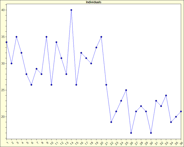
Ppk, on the other hand, uses the standard deviation from all of the data. We can call this the sigma of the individual values or sigmai. Sigma of the individual values looks at variation within and between subgroups. For a process that exhibits drifting, estimated sigma would not pick up the total variation in the process and thus the Cpk becomes a cloudy statistic. In other words, one can not be sure it is a valid statistic. In contrast to Cpk, Ppk, which uses the sigma of the individual values, would pick up all the variation in the process. Again, sigmai uses between and within subgroup variation. So if there is drifting in the process, sigmai would typically be larger than the estimated sigma, sigmae, and thus Ppk would, as it should, be lower than Cpk.Here is a quick review of the formulae for Cpk and Ppk:
|
Cpk = Zmin/3 where Zmin
|
Ppk = Zmin/3 where Zmin
|
|
|
Zmin = (USL – Mean) / est.sigma
|
Zmin = (USL – Mean) / sigmai
|
|
|
or = (Mean – LSL) / est. sigma
|
= (Mean – LSL) / sigmai
|
|
We should be concerned with how well the process is behaving, therefore Ppk might be preferred over Cpk. Ppk is a more conservative approach to answering the question, “How good is my process?” Watch for a future article discussing the relatively new capability index, Cpm, and how it stacks up against Cpk and Ppk.
Quality Advisor
A free online reference for statistical process control, process capability analysis, measurement systems analysis,
control chart interpretation, and other quality metrics.
SPC DEMO
Don’t miss out! Book a demo of our specialized SPC software and unlock immediate improvements in your processes.
Capability analysis: Indices
What are the measures of process capability?
These indices show what the process is “capable” of doing. This is the six sigma range of the inherent variation of a statistically stable process. Sigma is estimated using the ![]() /d2 formula.
/d2 formula.
What are the measures of process performance?
These indices show what a process is actually doing. This is the six sigma range of the total process variation, where sigma is usually determined by the sample standard deviation.
All of these capability indices can be calculated using software packages like SQCpack.
See also:
>> Can a process produce output within specifications?
>> Control vs capability
>> Normal data capability analysis
>> Non-normal data capability analysis
>> What is capability analysis and when is it used?
>> Learning more about capability
Quality Advisor
A free online reference for statistical process control, process capability analysis, measurement systems analysis,
control chart interpretation, and other quality metrics.
SPC DEMO
Don’t miss out! Book a demo of our specialized SPC software and unlock immediate improvements in your processes.
How do we determine process capability if the process isn’t normal?
Cp, Cpk, Pp, and Ppk do not necessarily rely on the normal distribution. If any of these indices increases, you know that the process capability has improved. What you do not know is how that improvement translates into good product. This requires knowledge of the distribution of the individual units produced by the process. The Central Limit Theorem refers to averages and this works for the control chart, but it doesn’t work for the histogram. Therefore, we generally make the assumption of the normal distribution in order to estimate the percent out of specification (above, below, and total).
For non-normal distributions, we first estimate some parameters using the data. We then use these parameters and follow a Pearson curve fitting procedure to select an appropriate distribution. Since the relationship between the standard deviation and the percent within CAN vary differently from the normal distribution for distributions that are not normal, (e.g., plus and minus one sigma may not equal 68.26%, plus and minus 2 sigma may not equal 95.44%, etc.), we try to transform the capability indices into something comparable. With this distribution equation, we integrate in from the tails to the upper and lower specifications respectively. Once the percent out-of-spec above and below the respective spec limits are estimated, the z values (for the normal with the same mean and standard deviation) associated with those same percents are determined. Then, Cpk and Ppk are calculated using their respective estimates for the standard deviation. This makes these values more comparable to those that people are used to seeing.